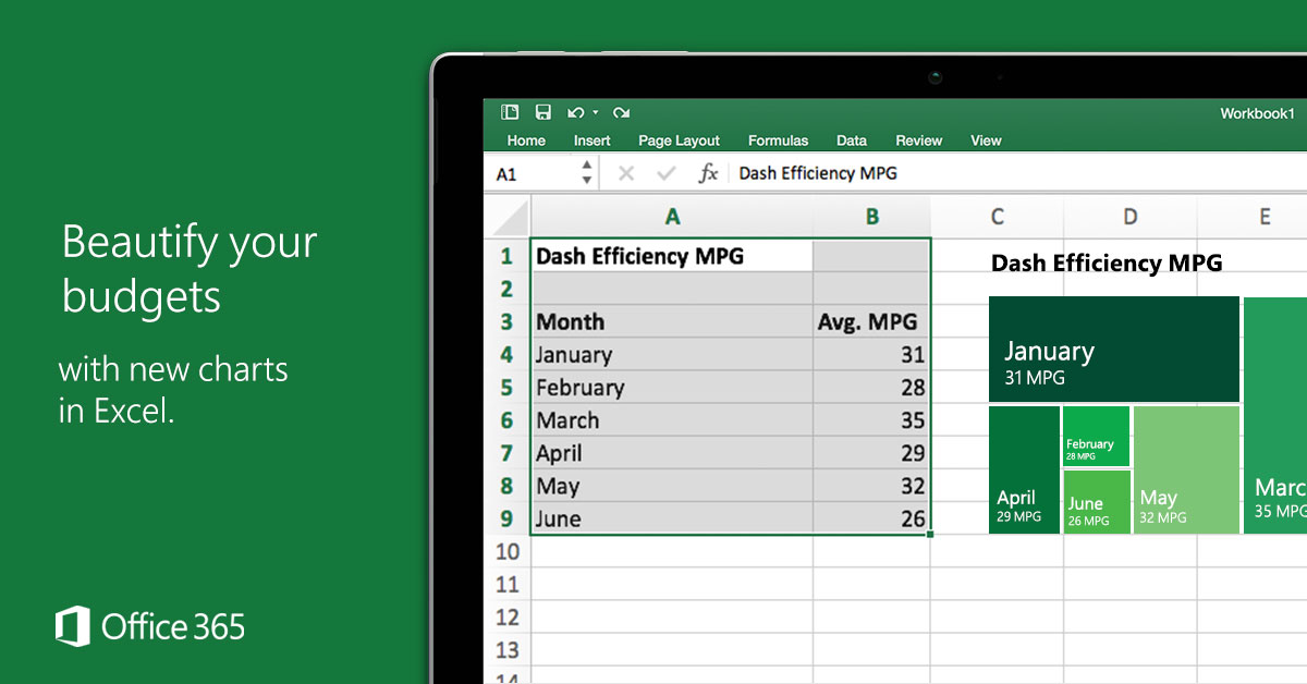
Microsoft’s Facebook ad for new features in Excel highlights the Treemap visualization, but gets it totally wrong.
A treemap is supposed to visualize relative size in a hierarchy. But in the illustration here, the data don’t fit this type of visualization (it’s a time series of one flat variable—without hierarchy).
But it’s even worse than that. The relative sizes don’t make sense! Why would the 31 MPG box for January be so much larger than the 32 MPG box for May?
This seems like a great illustration of why math/statistical education should be required for everyone—even visual designers and marketers. Or at least, the people selling the product should understand what the software actually does.
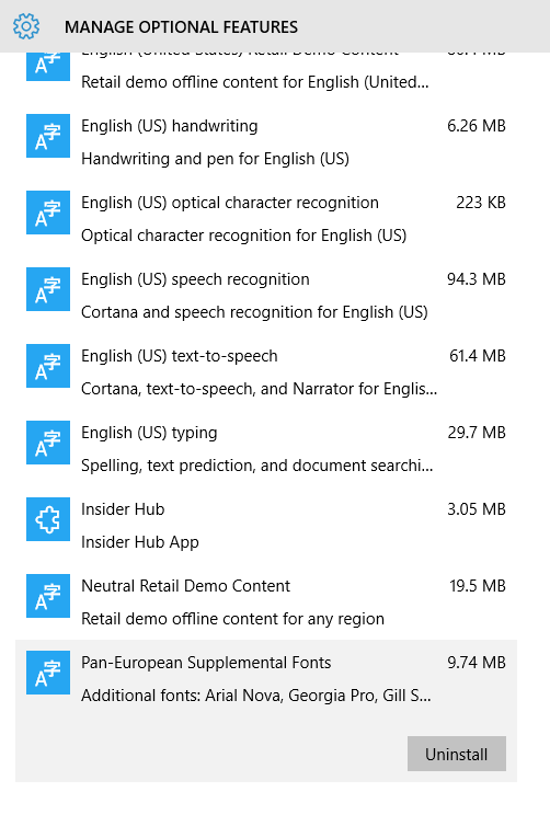
They’re hidden away in the optional features (“Pan-European Supplemental Fonts”), but easily installable from Settings -> System -> Apps & features -> Manage optional features.
Most of these are a refresh on classic Windows fonts like Arial, Georgia, and Verdana, but they should come as a welcome surprise!
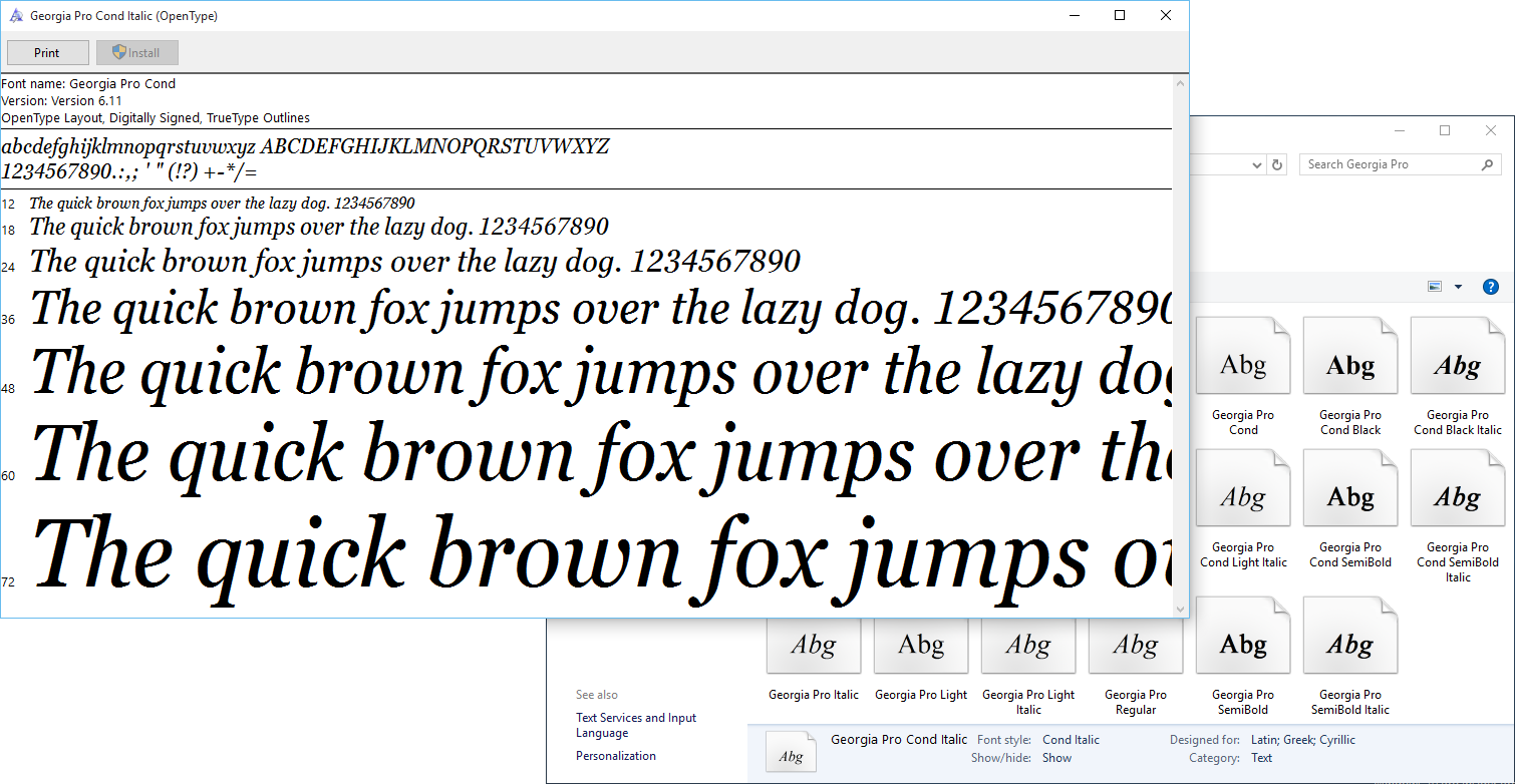
Georgia Pro Condensed Italic
Happy prerelease testing!
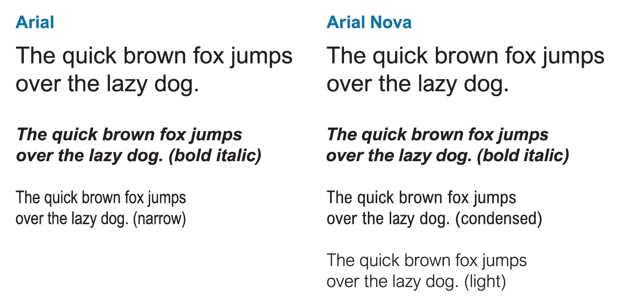
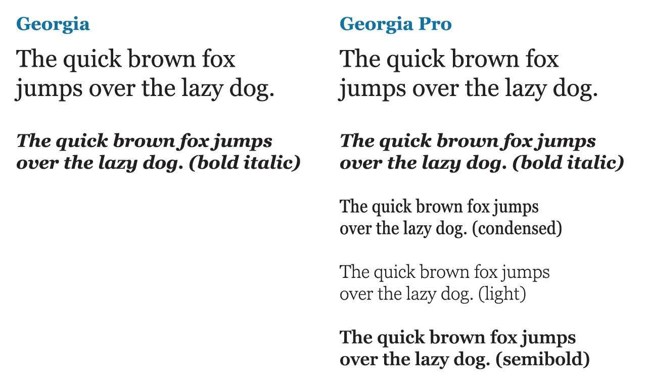
Update: upon request, here are side-by-side comparisons of the new fonts. A subset of available weights/variants is shown in each case. Note that, in most cases, the “Pro” versions add new variants (e.g. Condensed, Light, Semibold, etc) but do not differ significantly in the Regular/Bold/Italic/Bold Italic weights from their ancestors.
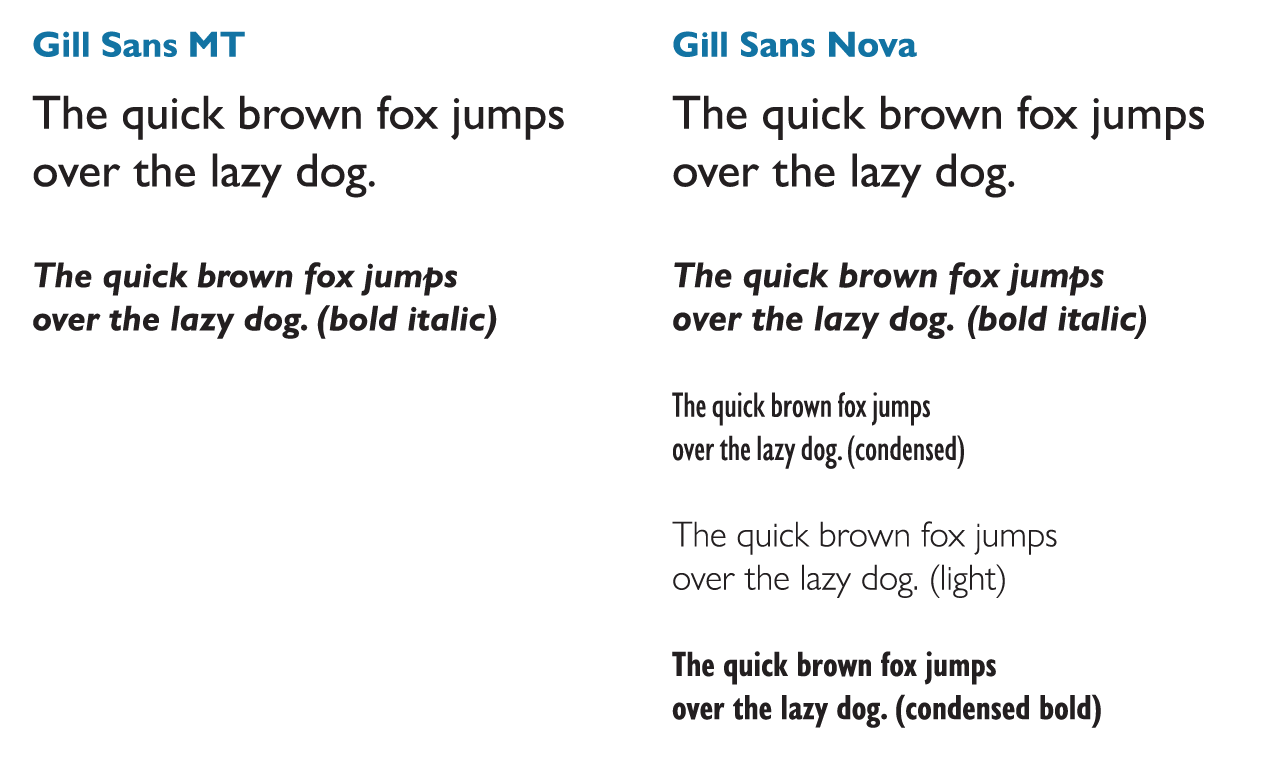
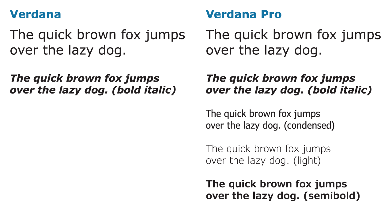
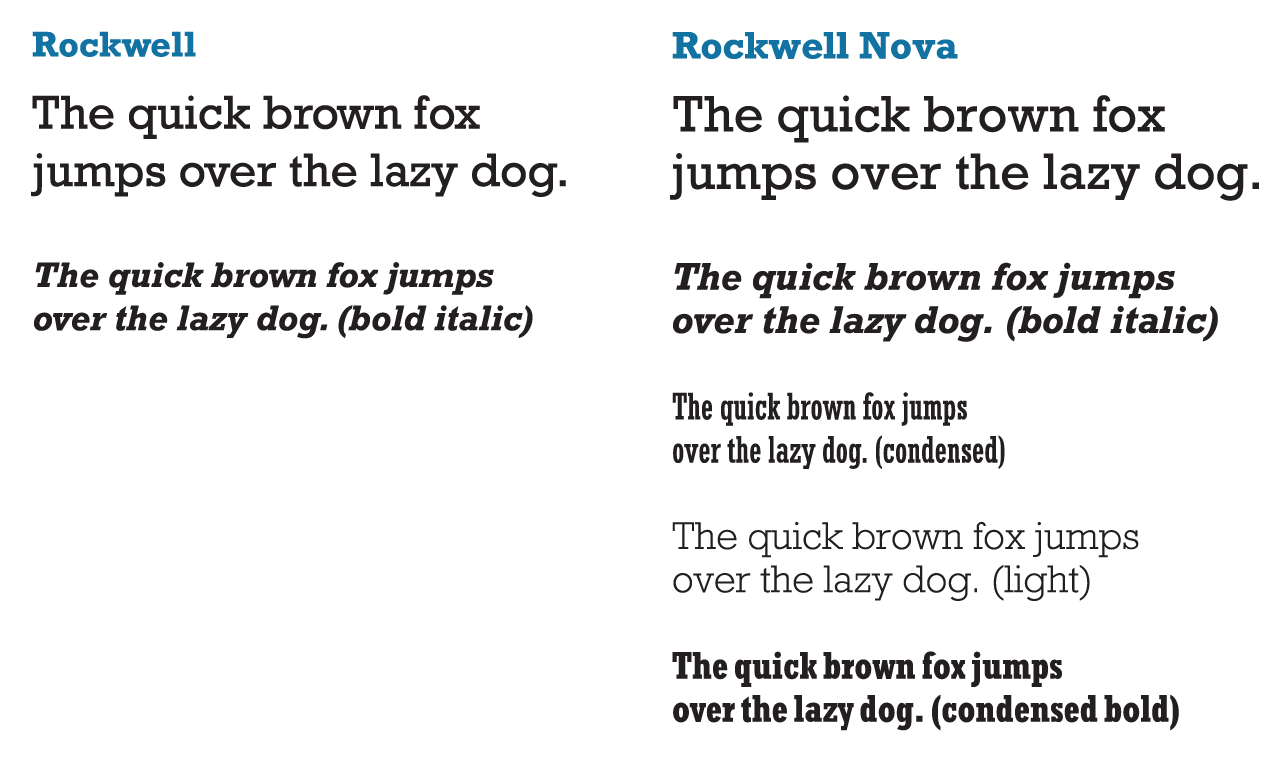
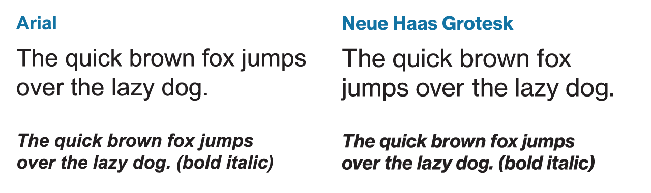
Arial vs. Arial NovaGeorgia vs. Georgia ProGill Sans MT vs. Gill Sans NovaVerdana vs. Verdana ProRockwell vs. Rockwell Nova; in this case, the Nova font also has different metricsArial vs. Neue Haas Grotesk Text Pro
When I first came to Penn, the website for the Nominations & Elections Committee looked like this:
No, this wasn’t the year 1999… this was in 2011.
NEC website redesign
I set out to redevelop and redesign this, upgrading it from a static HTML site edited over SFTP to a WordPress CMS on Canvas. More importantly, the website redesign in 2012 needed to fit the rebranding that Penn underwent that academic year. In other words, I wanted it to look more like the university’s design. (An email to the Communications office responsible for web assets clarified that we could, in fact, do this.)
I’ve been a proud Android user for years. Yesterday, I became even stauncher of a loyalist.
I only had to look at some of the incredibly stupid decisions Apple made with its iOS 7 redesign. There’s no need for me to write a long rant because that’s already been done — by countless individuals.
Basically, there was nothing significantly innovative in this iteration, and the design is now a horrible, inferior mixture of Windows Phone/Metro, Android, and WebOS.
Just compare the icons of “stock” apps on Android 4.2.2 (on my Nexus 4, left) vs iOS 7 (from the Apple site).
Both sets have moved away from skeuomorphism, but Android’s is more professional
The legacy rounded corners in the iOS designs, the mid-2000s gradients, and bubbly, cartoonish icons don’t fit the image of a polished operating system. The roundness of it all is really bad considering the emphasis on flatness in the calculator and call screen (or FaceTime incoming screen).
What really struck me was the redesign of the 4 core dock icons. I don’t think I’m crazy in picking stock Android over iOS 7 on this one:
A typical set of Android dock icons compared to their iOS 7 equivalents
I have neglected this blog for so long that I owe it to myself to post some more stuff here. Since I’m in China for about two and half weeks, I might as well blog about it — complete with photos*.
* I apologize in advance: most of the pictures are low quality photos from my cell phone.
Purchasing Power Parity and Prices
From what I saw yesterday (let’s call it Day 0), items that are cheap in Canada and/or the United States can be insanely expensive here, while others that are reasonably expensive in Canada are dirt cheap here.
There’s a supermarket / department store chain called Carrefour that has everything imaginable, from imported milk to cell phones to oranges to suitcases. Asian ice cream bars can cost as little as $2 CAD for a package of multiple bars, while I saw a knife priced over ¥1500 and woks up to ¥809.
Really expensive wok in China -- ¥809. I guess some Westerners might be willing to pay the equivalent amount in USD for their pans, but this is still really high.
Aside: there’s an abundance of Engrish products, like “Woman Honey” and “Cuboid Sausage”.
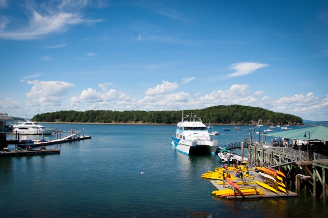
Yet cab rides in Wuxi are dirt cheap. ¥15 brought four people from one side of town to the other — and I would probably estimate a bill of $15-20 USD (+tip) for the equivalent ride in Philadelphia. (I sometimes wonder how that money can possibly be enough to cover the insurance needed for such risky driving.) I’m told that public transit is even cheaper — something like ¥1 fares, not to mention seniors ride free.
The problem with the high prices here (inconsistent with purchasing power parity, which suggests that the price of a good here should be roughly the price of a good in Canada, for example, times the exchange rate) is that incomes are also lower in comparison. When nominal wages are low and prices are high, we come to the uncomfortable conclusion that real wages remain incredibly depressed for most citizens, and the inevitable result that the ordinary standard of living here still falls behind Canada and the US.
But food can be cheap
Restaurants can be pretty cheap. For breakfast today on Day 1, I went somewhere that is held in high regard for this particular type of breakfast/dim sum. ¥8 for a bowl of wonton, or for four meat buns (小笼包).
Delicious meat buns, with a unique Wuxi recipe.
Aside: to eat 小笼包:
Pick up carefully with chopsticks from the tray seen above.
Bite a small piece, preferably in the lower half, on the side.
Without letting go, suck out the juices inside. (Caution: may be hot!) There’s a lot of it, and it tastes so good — it would be wasted if you ate the bun normally and let it leak out.
Bite and chew rest of the bun as you might ordinarily do.
In essence, a delicious breakfast meal can be had for $3-4 USD — under the price of a Starbucks mocha in North America.
Road rage is normal
I’m a little afraid to be on the road here.
As a pedestrian accustomed to drivers yielding the way, I’m likely to get injured, because here, people have to yield to cars, for the simple reason that the cars drive aggressively.
As a rider in cabs, I’m afraid every time the taxi makes a turn, because it always feels like we’ll hit a bike or a pedestrian. Every lane change is practically cutting someone off. And on at least one occasion, the driver has gone onto the opposite side of the road to bypass really slow cars.
There is no f’ing way I would drive here, or even survive trying.
Also, there are mopeds everywhere.
China’s learning the good and the bad from American capitalism
On the bright side, Chinese people seem to have learned that there’s money to be made from taking risks and launching small businesses. There are lots of little shops of all kinds, many of them fashion or textile shops (people love to browse them but not buy from them). Some of these stores occupy the first floor of an otherwise decrepit building — but the shops themselves are nicely renovated and decorated.
A textile and fabrics store in Wuxi
On the opposite side, the income disparity seems to be increasing rapidly. Some alleys have people labouring to survive (e.g. cleaning shoes, fixing bike tires) while nearby streets boast Louis Vuitton stores and Häagen-Dazs ice cream.
Luxury stores are all around
Interestingly, rich and poor seem to coexist in the same spaces in Wuxi. Unlike the sharp divisions between good and bad neighbourhoods in some American cities (*cough* Philadelphia), it’s hard to find lower-income citizens in a place of their own.
Alleyway of labourers
I walked by an alleyway where construction workers probably lived. There was a cluster of people around something that resembled an outdoor food cart, but it wasn’t open to the general public — it was set up so that the community of laborers could eat affordably.
Labourers getting food for brunch
Historic gardens (preview)
I’m going to post more photos from this venue in Part 2 of Day 1. We took somewhere between 250 and 300 photos of this historic site, where ancient architecture and estates from earlier eras, trees hundreds of years old, and an intricate system of stone wells that collect mountain water, have been preserved. I’m going to need some time to sort through the photos.
(My uncle, who teaches martial arts, served as a tour guide and explained the historical/cultural significance of many of the sights.)
I also saw beautiful slabs of stone with engraved calligraphy, from different eras hundreds of years past. Even hundreds of years ago, the basis for the modern written Chinese language had already been set.


