Microsoft derps on Excel ad

Original resolution of Excel ad showing treemap chart

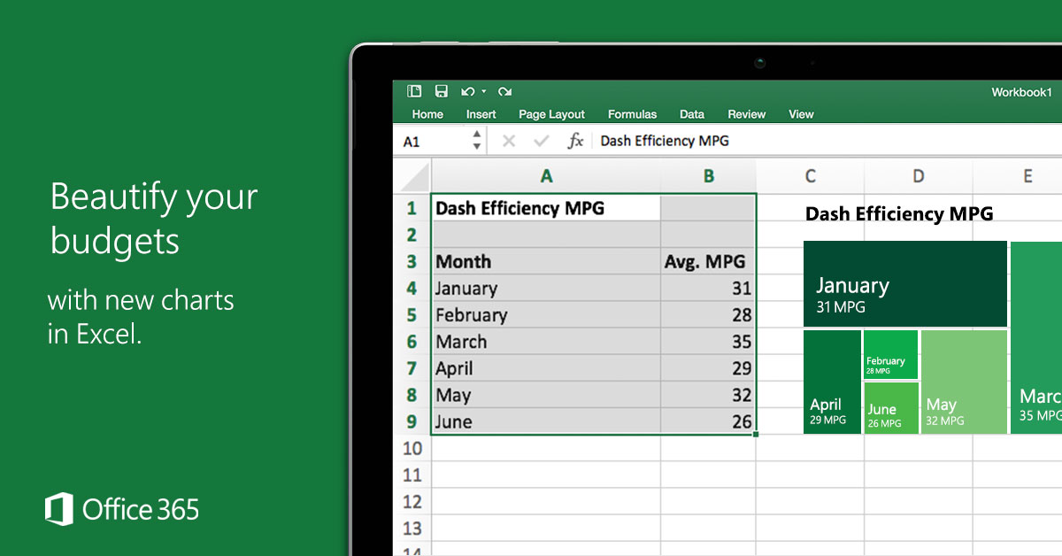
Microsoft’s Facebook ad for new features in Excel highlights the Treemap visualization, but gets it totally wrong.

Ad for Excel visualization features

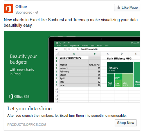
A treemap is supposed to visualize relative size in a hierarchy. But in the illustration here, the data don’t fit this type of visualization (it’s a time series of one flat variable—without hierarchy).

Original resolution of Excel ad showing treemap chart

But it’s even worse than that. The relative sizes don’t make sense! Why would the 31 MPG box for January be so much larger than the 32 MPG box for May?

This seems like a great illustration of why math/statistical education should be required for everyone—even visual designers and marketers. Or at least, the people selling the product should understand what the software actually does.

New fonts in Windows 10

Arial Nova in Windows 10?

Did anybody else notice this?

Update: Rockwell Nova also.

They’re hidden away in the optional features (“Pan-European Supplemental Fonts”), but easily installable from Settings -> System -> Apps & features -> Manage optional features.

Pan-European Supplemental Fonts in Windows 10

Most of these are a refresh on classic Windows fonts like Arial, Georgia, and Verdana, but they should come as a welcome surprise!

Georgia Pro Condensed Italic

Happy prerelease testing!

Update: upon request, here are side-by-side comparisons of the new fonts. A subset of available weights/variants is shown in each case. Note that, in most cases, the “Pro” versions add new variants (e.g. Condensed, Light, Semibold, etc) but do not differ significantly in the Regular/Bold/Italic/Bold Italic weights from their ancestors.

Arial vs. Arial Nova
Georgia vs. Georgia Pro
Gill Sans MT vs. Gill Sans Nova
Verdana vs. Verdana Pro
Rockwell vs. Rockwell Nova
Rockwell vs. Rockwell Nova; in this case, the Nova font also has different metrics
Arial vs. Neue Haas Grotesk Text Pro

Found some old screenshots…

When I first came to Penn, the website for the Nominations & Elections Committee looked like this:

Old NEC site circa 2011
No, this wasn’t the year 1999… this was in 2011.

NEC website redesign

I set out to redevelop and redesign this, upgrading it from a static HTML site edited over SFTP to a WordPress CMS on Canvas. More importantly, the website redesign in 2012 needed to fit the rebranding that Penn underwent that academic year. In other words, I wanted it to look more like the university’s design. (An email to the Communications office responsible for web assets clarified that we could, in fact, do this.)

Continue reading “Found some old screenshots…”

iOS 7 icons: you can’t be serious

I’ve been a proud Android user for years. Yesterday, I became even stauncher of a loyalist.

I only had to look at some of the incredibly stupid decisions Apple made with its iOS 7 redesign. There’s no need for me to write a long rant because that’s already been done — by countless individuals.

Basically, there was nothing significantly innovative in this iteration, and the design is now a horrible, inferior mixture of Windows Phone/Metro, Android, and WebOS.

Just compare the icons of “stock” apps on Android 4.2.2 (on my Nexus 4, left) vs iOS 7 (from the Apple site).

Both sets have moved away from skeuomorphism, but Android's is more professional
Both sets have moved away from skeuomorphism, but Android’s is more professional

The legacy rounded corners in the iOS designs, the mid-2000s gradients, and bubbly, cartoonish icons don’t fit the image of a polished operating system. The roundness of it all is really bad considering the emphasis on flatness in the calculator and call screen (or FaceTime incoming screen).

What really struck me was the redesign of the 4 core dock icons. I don’t think I’m crazy in picking stock Android over iOS 7 on this one:

A typical set of Android dock icons compared to their iOS 7 equivalents

Don’t get me started on how cluttered Control Center looks.

I’ll just leave you to read a “quick feature comparison” between iOS 7 and Android.

TL;DR I’m not impressed.