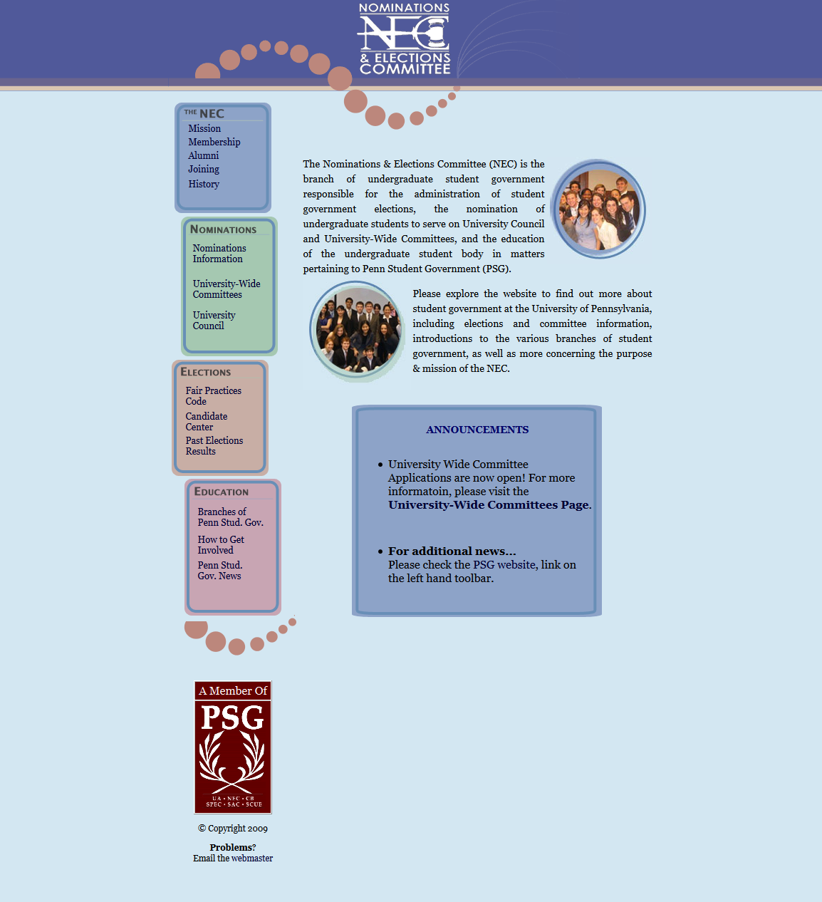
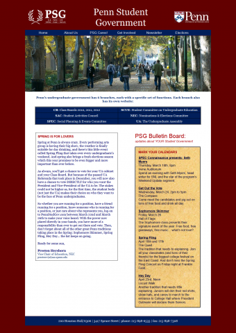
When I first came to Penn, the website for the Nominations & Elections Committee looked like this:
NEC website redesign
I set out to redevelop and redesign this, upgrading it from a static HTML site edited over SFTP to a WordPress CMS on Canvas. More importantly, the website redesign in 2012 needed to fit the rebranding that Penn underwent that academic year. In other words, I wanted it to look more like the university’s design. (An email to the Communications office responsible for web assets clarified that we could, in fact, do this.)
Most of the work was porting over Penn’s styles in CSS to a completely different HTML structure. There was a lot of struggle with conflicting styles defined by the Canvas framework/theme, which needed to be overridden. Any of the webdevs out there will know what a pain this was.
I also had to trace the logo (which we only had as a small ~200 pixel wide bitmap) and fix the awful gavel that resulted from the live trace:

Redesign, first iteration (never launched)
Trust me, this wasn’t ready for launch.
The barebones of what would become the current site were already visible, and the basic typographic styles (which are still in use today) had been implemented.
 There was still a lot to be improved. For one, the design was awfully devoid of graphic content, and the site title stated under the logo seemed redundant.
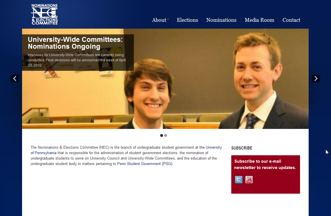
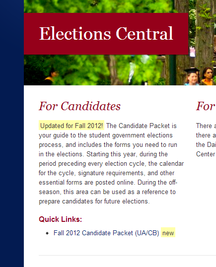
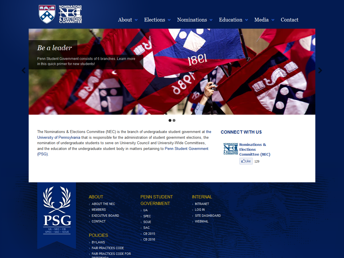
Redesign, second iteration (launched Fall 2012)
Main subsection pages became illustrated with bright campus photo banners, consistent with the Penn theme, instead of a redundant site title.
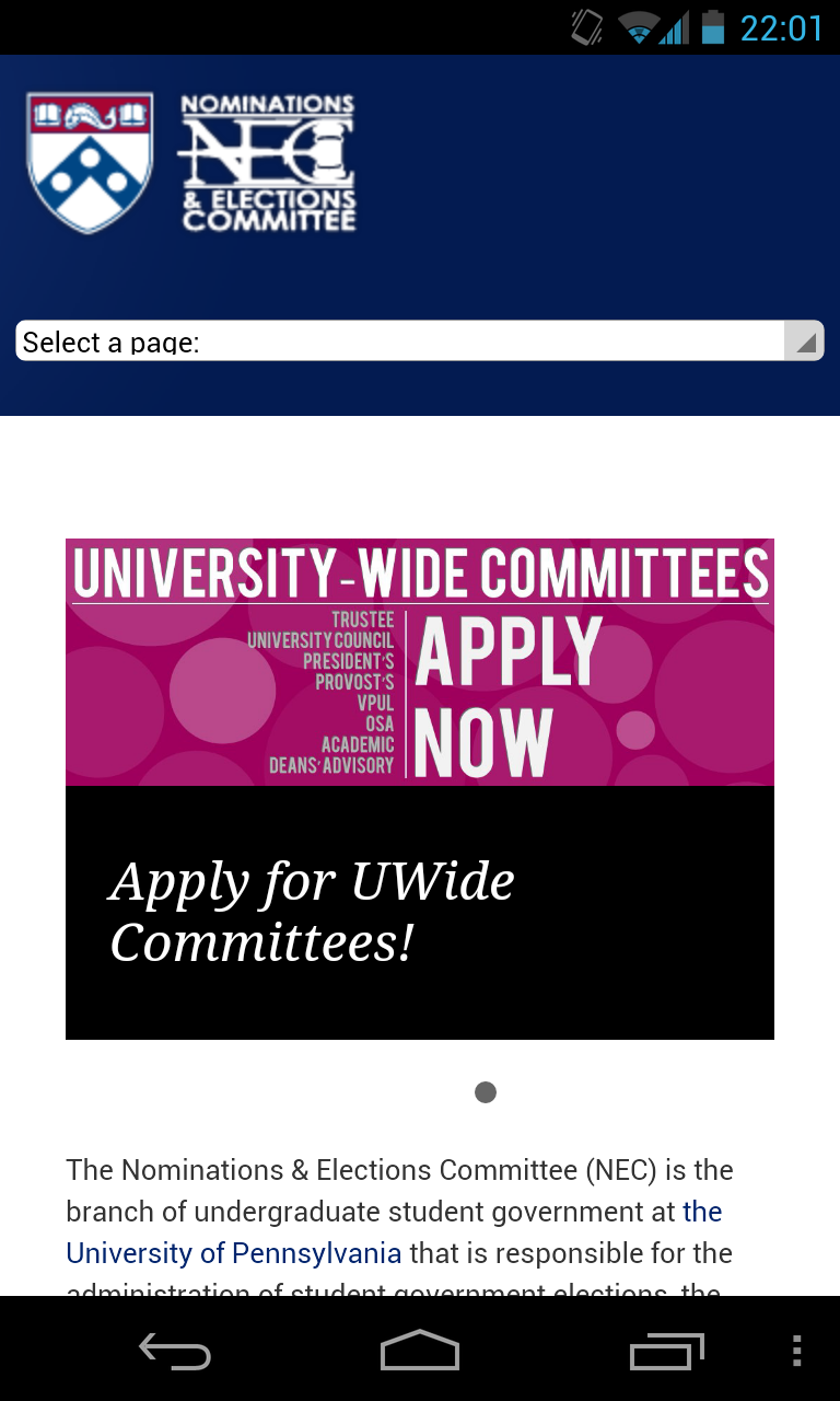
The logo at the top was updated to include an appropriate crest and drop shadow. At this point, though, the mobile view was still awful.
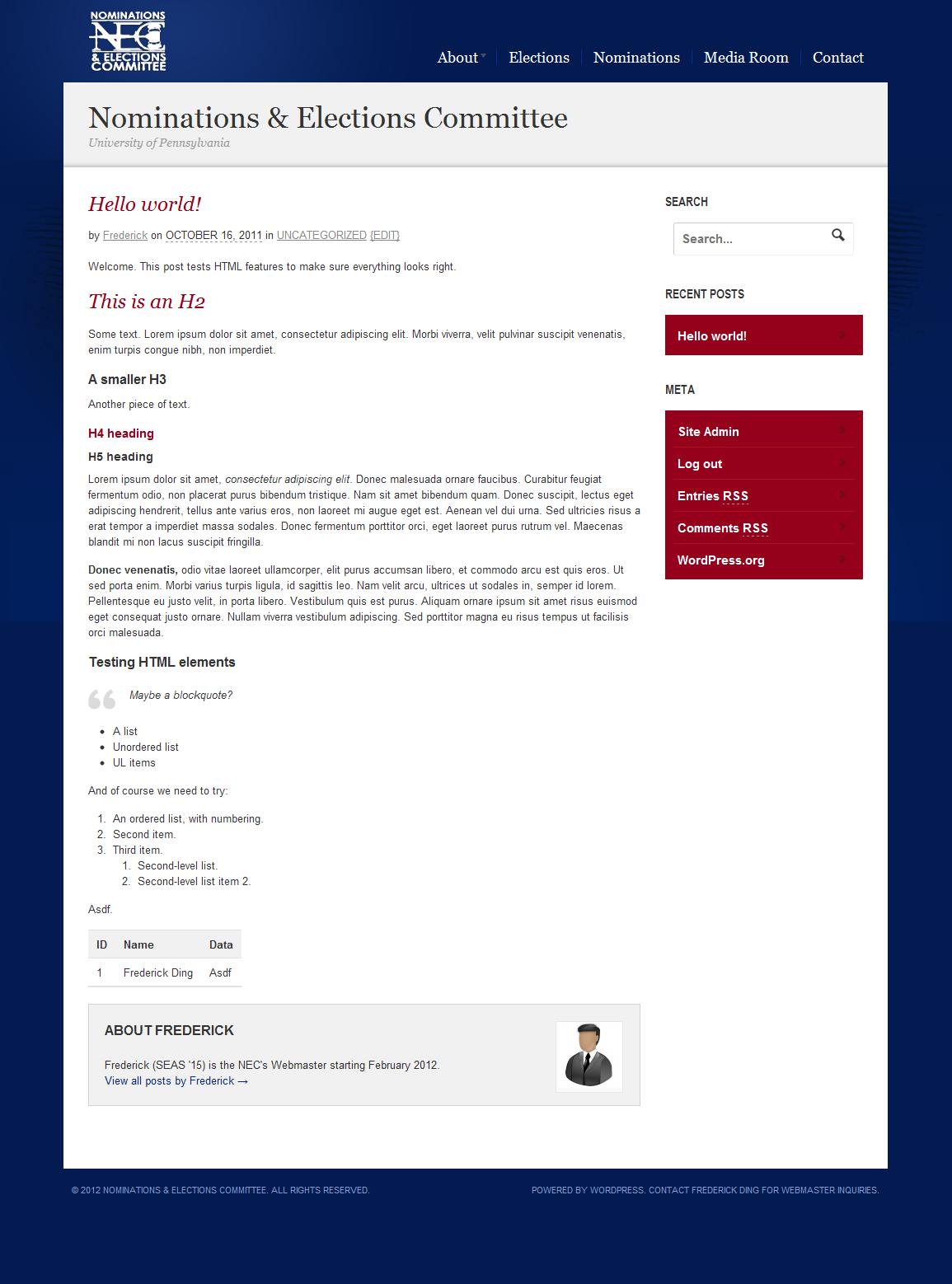
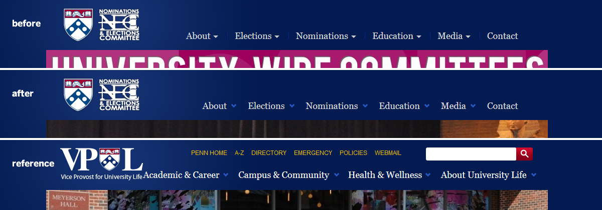
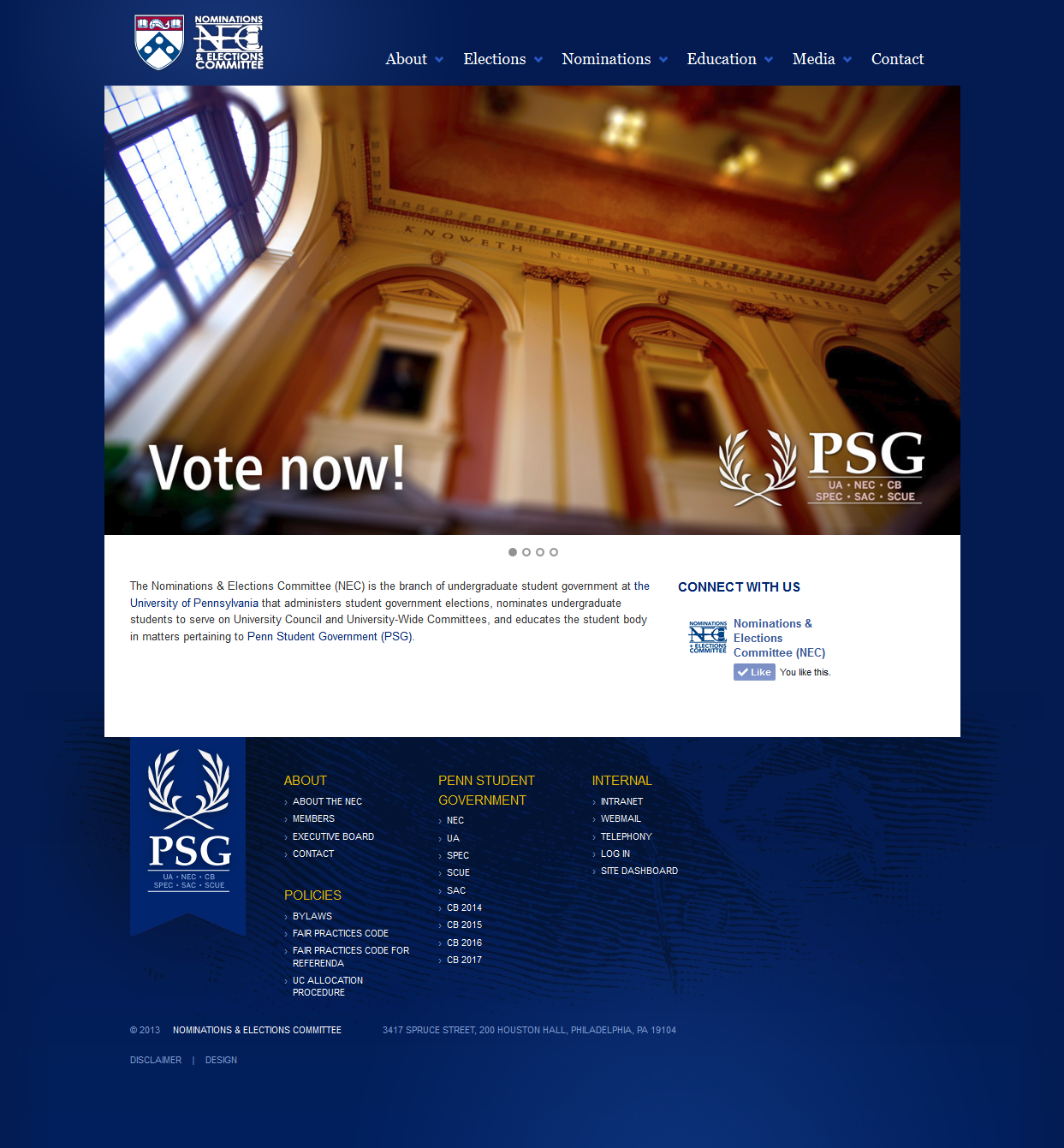
Redesign, third iteration (deployed Spring/Summer 2013)
From this point forward, most changes were rather subtle, with the exception of an upgrade in the Canvas theme/framework which enhanced the responsive view for mobile/tablet devices.
In 2013, the header navigation dropdowns were updated to be in line with the VPUL navigation design. A HiDPI/Retina logo with hover-over glow effects was added. (There was a later, subtler change not captured by this screenshot, in which the font colour for top level navigation items was boosted to #ffffff white from its previous gray.)
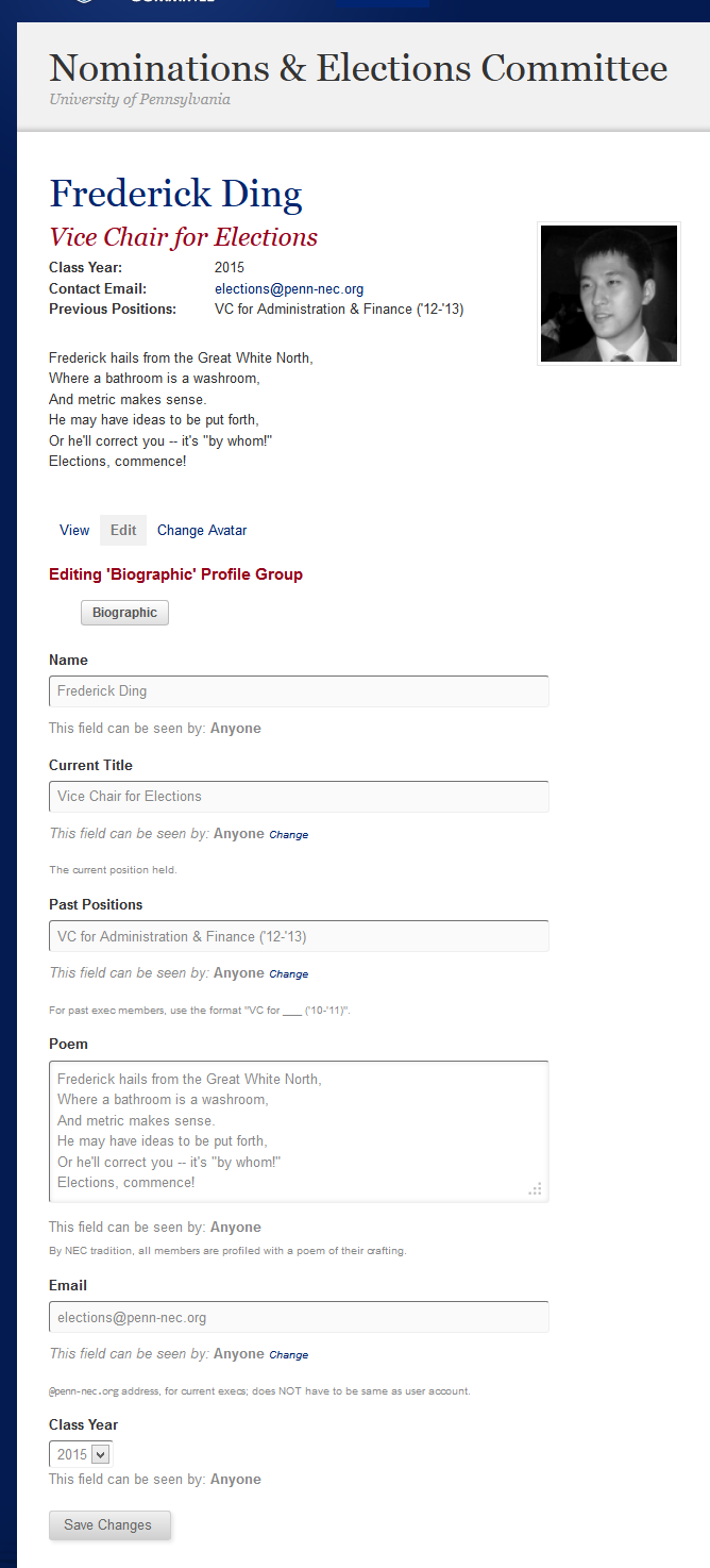
 The changes weren’t merely aesthetic. Behind the scenes, I installed BuddyPress so that we could deliver dynamic member profiles and listings, including an individualized page for each member.
 The footer was built out significantly, with added links both for navigating within the site as well as for finding related peer sites. The home page in this third iteration looks very similar to how it looks today at time of publishing.
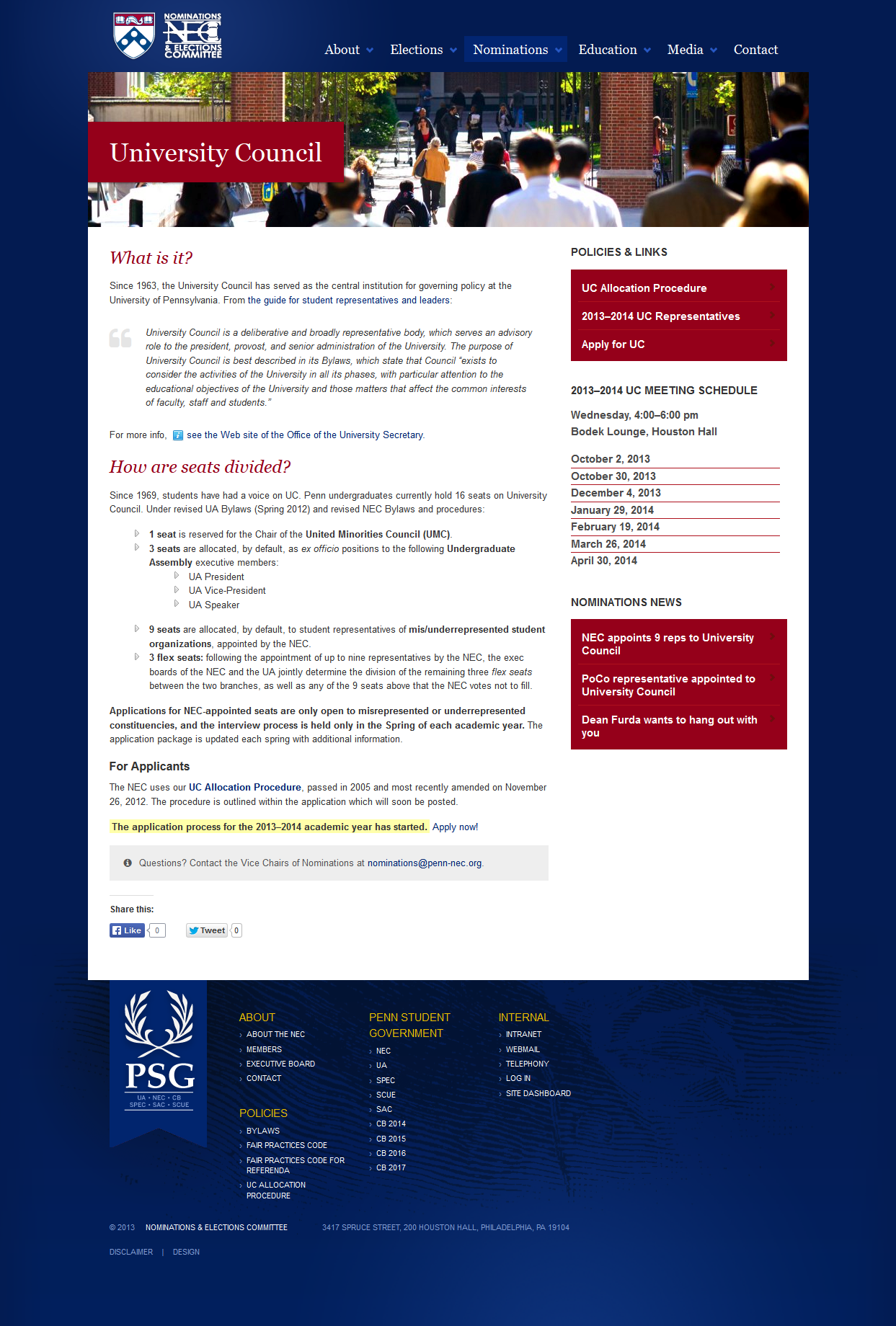
Iteration in use today (Fall 2014)
The NEC site remains, in my opinion, the prettiest of all of the Penn Student Government branches, and I’m super happy with its role in presenting ourselves as one of the most professional, if not most technologically daring, non-tech student groups on Penn’s campus.
PSG website redesign
For many years, the website that serves as a portal to online voting as well as all the undergraduate student government branches collectively was also looking quite outdated and early-2000s-y.
By adopting LESS as a CSS preprocessor (in conjunction with some Git branching), I was able to adapt a customized version of the modern NEC theme to the red PSG site.
The tricky part here was actually filtering the existing blue image assets so that they would:
- look red;
- match the red of the official Web colours; and
- not look distorted or degraded after processing
There was also some experimentation with font/background colours so that visual cues like blue links could be retained, yet the site would overall look red.
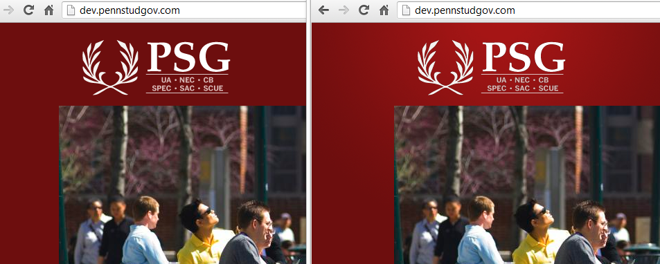
Logo refresh
Before even experimenting with background images, I had to deal with the logo.
Old: unfortunately, I think this was the highest resolution we had.
![]()
New: vectorized and re-typeset. Also notice the attention to detail in the exact radial gradient background behind the logo.
There’s no real need for me to go into lengthy detail here, except to show you the final result. You can visit the site yourself.
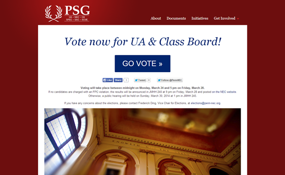
This is the landing page that at least 4000 undergrads visited in the course of one week during the Spring 2014 elections, to vote and see the results:
I’m pretty proud…
… of my handiwork. And I’m very emotionally invested in it.
What do you think?