Based on https://community.spiceworks.com/topic/1408834-removing-windows-10-apps-gpo, with the additional refinement of a filter that removes only Store apps and not system apps or frameworks, using PowerShell:
1. List the apps that would be uninstalled.
The -AllUsers flag requires an elevated PowerShell run on an administrator account. Omit the -AllUsers flag if running as a nonadministrator for the current user.
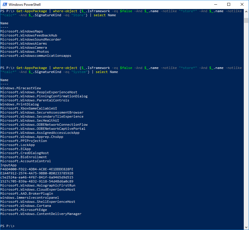
Get-AppxPackage -AllUsers | where-object {$_.IsFramework -eq $false -And $_.name -notlike "*store*" -And $_.name -notlike "*calc*" -And $_.SignatureKind -eq "Store"} | select Name
On a 1711 newly installed VM, this resulted in this list:
Name
----
Microsoft.MicrosoftOfficeHub
Microsoft.Microsoft3DViewer
Microsoft.ZuneVideo
Microsoft.WindowsMaps
Microsoft.WindowsFeedbackHub
Microsoft.BingWeather
Microsoft.Messaging
Microsoft.MicrosoftStickyNotes
Microsoft.XboxIdentityProvider
Microsoft.XboxSpeechToTextOverlay
Microsoft.Print3D
Microsoft.GetHelp
Microsoft.WindowsSoundRecorder
Microsoft.Getstarted
Microsoft.WindowsCamera
Microsoft.3DBuilder
Microsoft.Xbox.TCUI
Microsoft.People
Microsoft.RemoteDesktop
Microsoft.XboxGameOverlay
Microsoft.Office.Sway
Microsoft.Windows.Photos
Microsoft.MSPaint
Microsoft.SkypeApp
Microsoft.XboxApp
Microsoft.DesktopAppInstaller
Microsoft.WindowsAlarms
Microsoft.OneConnect
Microsoft.Wallet
Microsoft.ZuneMusic
Microsoft.Office.OneNote
microsoft.windowscommunicationsapps
Microsoft.MicrosoftSolitaireCollection
2. Actually uninstall them.
Get-AppxPackage -AllUsers | where-object {$_.IsFramework -eq $false -And $_.name -notlike "*store*" -And $_.name -notlike "*calc*" -And $_.SignatureKind -eq "Store"} | Remove-AppxPackage
Certain apps that cannot be uninstalled might be listed in the output.